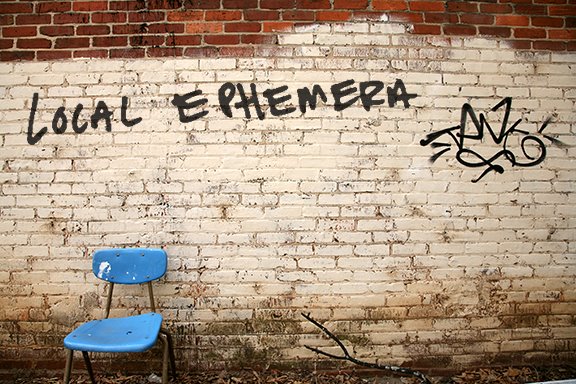
A walk in my neighborhood looks something like this

or a dirtier, less golden, version of these over-priced bungalows
on said walk one can see art such as this.
 Jessica Dodd - "The Flood (On Chair)" Digital print
It's the "SCAD at the Edge" show at Vaknin Gallery curated by the great artist and professor Larry Jens Anderson. As one could probably guess, it's a group show of work by BFA and MFA students currently at SCAD Atlanta.
 "The Flood (TV Dinner)" 2007 Digital print
Architecture and a general pessimism towards old models of community (Stansell above) along with autobiographical figurative work seemed common threads but there was not an overall theme to the show. The subject matter stayed clear of politics with a few exceptions like Jessica Dodd's interesting staged photographs of miniature environments that timidly suggested New Orleans after Katrina.
 Jessica Dodd - "The Flood (On Chair)" Digital print
It's the "SCAD at the Edge" show at Vaknin Gallery curated by the great artist and professor Larry Jens Anderson. As one could probably guess, it's a group show of work by BFA and MFA students currently at SCAD Atlanta.
 "The Flood (TV Dinner)" 2007 Digital print
Architecture and a general pessimism towards old models of community (Stansell above) along with autobiographical figurative work seemed common threads but there was not an overall theme to the show. The subject matter stayed clear of politics with a few exceptions like Jessica Dodd's interesting staged photographs of miniature environments that timidly suggested New Orleans after Katrina.
The show had a wide range of ideas at play but in a surprisingly narrow focus on painting and photography, with little three-dimensional work present. While the aim of the exhibition seemed to be a cherry picking of newfangled art happnin at SCAD, I am not sure "edgy" describes it.


Even if there was this cool limestone sculpture by Audrey Ward called "On the Edge." To be a show of current art school students, I never had that "whoa, that's a crazy mind-bending pile of cardboard and toothpaste!" moment. The thinking stayed squarely inside the box, investigating materials and methods that are becoming humdrum in Contemporary art (at least for those crazy art kidz).

So I sound jaded (or bored). But I found Robert Gill's c-print "Red Stairs" slick and technically impressive. Is it really a C-print? I would have guessed photoshop and a digital printer were involved in this unusually vertical, with absolutely no lens curving, photograph.
 "The Third Wish" 2007 watercolor, resin on panel
Pam Roger's "The Third Wish" was an interesting organic piece though I would venture to say the drips only distracted from Roger's drawing ability. The painting was a needed companion to Ward's limestone sculpture, which upon further consideration may have been my favorite piece in the show.
 Carla Aaron-Lopez - "Friday Stabbed Our Chicken" 2007 digital print
Or maybe it was was "Friday Stabbed Our Chicken" by Carla Aaron-Lopez. Yes, the more clever name breaks the tie. This a great photograph. This is the piece in the show with balls.

Lopez, ala Duane Michaels, Chris Verene, et al, added her own biographical text to the bottom of the image. I'd say the image is strong enough it doesn't need the one liner. Unlike Verene's approach to photographing and taking notes on a particular community as a form of documentation, Lopez's snapshot style needs no other grounding than the glint of a camera flash on a knife handle.

So I sound jaded (or bored). But I found Robert Gill's c-print "Red Stairs" slick and technically impressive. Is it really a C-print? I would have guessed photoshop and a digital printer were involved in this unusually vertical, with absolutely no lens curving, photograph.
 "The Third Wish" 2007 watercolor, resin on panel
Pam Roger's "The Third Wish" was an interesting organic piece though I would venture to say the drips only distracted from Roger's drawing ability. The painting was a needed companion to Ward's limestone sculpture, which upon further consideration may have been my favorite piece in the show.
 Carla Aaron-Lopez - "Friday Stabbed Our Chicken" 2007 digital print
Or maybe it was was "Friday Stabbed Our Chicken" by Carla Aaron-Lopez. Yes, the more clever name breaks the tie. This a great photograph. This is the piece in the show with balls.

Lopez, ala Duane Michaels, Chris Verene, et al, added her own biographical text to the bottom of the image. I'd say the image is strong enough it doesn't need the one liner. Unlike Verene's approach to photographing and taking notes on a particular community as a form of documentation, Lopez's snapshot style needs no other grounding than the glint of a camera flash on a knife handle.


No comments:
Post a Comment